In 2026, online attention spans are shorter than ever. You don’t have five minutes to slowly explain the depth of your methodology or show off your entire portfolio. When clients land on your site, you have exactly six seconds before their brain decides whether to stay or hit the “back” button, that’s why the name “6-second” website test.
The brutal truth? Many brilliant female founders design their websites for themselves. They focus on poetic, vague copywriting or ultra-trendy fonts that look beautiful but say absolutely nothing.
If your website isn’t converting silent visitors into inquiries, the issue is almost always hiding right there, at the very beginning of your homepage.
Enter the 6-second website test: a quick, three-question test you can run today to see if your website header is letting your revenue slip away.
What is “Above the Fold” and Why is it Premium Digital Real Estate?
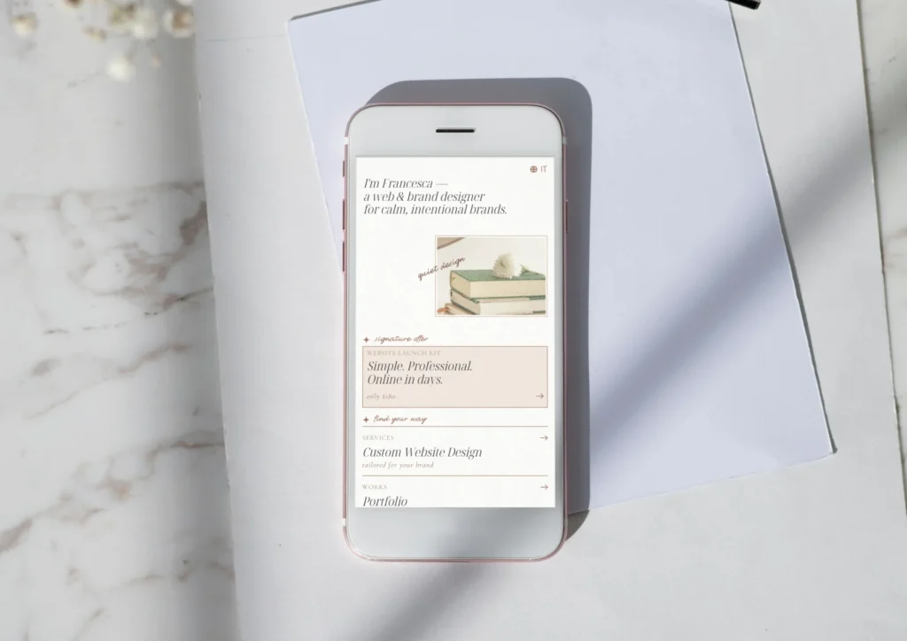
In web design, the expression “above the fold” refers to everything visitors see on their computer or phone screen the exact moment the page loads, before they even start scrolling down.
Think of this space as your brand’s welcoming mat and your primary hook. The psychology of user behavior tells us that if this initial section fails, the rest of your gorgeous page doesn’t matter—because no one will ever scroll down to see it.
Your header should never just be “pretty.” It needs to act as a strategic filter that instantly qualifies your ideal client.

The 3 Questions Your Website Must Answer in 6 Seconds
The moment clients land on your homepage, their subconscious frantically scans your header looking for the answers to three precise questions. If they can’t find them in six seconds, they leave.
1. What do you actually do? (The Clarity Test)
- The Trap: Using abstract phrases full of buzzwords that mean absolutely nothing, like “I help people unlock their potential and co-create a 360-degree vision of success for their future.” (It sounds professional, but concretely, what does someone get when they pay you?)
- The Solution: Direct, down-to-earth copywriting without beating around the bush. “Financial consultant for freelancers who want to learn how to manage taxes without panicking.” Be incredibly clear.
2. How will it make my life better? (The Transformation)
You need to instantly connect your service to an emotional or financial return on investment (ROI). Are you saving them twenty hours a week? Are you erasing their tech stress? Are you boosting their launch sales? Show them the final destination.
3. What should I do next? (The Call to Action)
- The Trap: Having no button in the header at all, or having three competing buttons (“Read the Blog”, “About Me”, “Book a Call”).
- The Solution: One single, clear path. Choose your primary business goal and make sure it’s the only button visible at the very beginning.
Layout and Visuals: The Designer’s Touch
As a designer, I can tell you that clear copywriting is only half the battle. You can have the most brilliant slogan in the world, but if the visual layout is cluttered, the visitor’s brain experiences cognitive fatigue and disconnects.
Here are 3 visual layout flaws that might be quietly killing your website conversions right now:
- The Ghost CTA: This happens when the button blends perfectly into the background photo or your brand colors. If your palette is soft, neutral, and earthy, your main button needs a strong, intentional contrast color so the eye naturally snaps to it.
- Visual Overload and Lag: Too many moving text elements, complex animations, or heavy background videos that take an eternity to load on phones. A slow website is a broken website.
- The Mobile Disconnect: A layout that looks stunning on desktop, but squishes the text directly over your face in the background photo on an iPhone screen, making the headline unreadable and the button impossible to click.
How to Run the 6-Second Website Test on Your Own Site
Let’s test your site right now:
- Open your homepage on your mobile phone.
- Close your eyes for three seconds, open them, and start a timer.
- Look at the screen for exactly six seconds, then lock your phone.
Can you confidently answer what you do, who it’s for, and what the next step is based only on what you just saw? If the answer is no—or if you had to scroll down to find those answers—your layout is costing you clients.
Conclusion: Clarity Beats Forced Originality Every Single Time
An aesthetically stunning website is completely useless if it leaves your ideal audience guessing what you sell. You don’t need a massive, stressful, and expensive 20-page overhaul to fix your business. Often, a strategic layout refresh of your header is all it takes to turn casual visitors into high-budget leads.
Ready to make your online presence reflect the true value of your work?
If you feel like your current site is holding you back, I can help you build a consistent identity that aligns with your goals.
Contact me for a consultation or explore my Services to see how we can elevate your online presence together.
Did you enjoy this approach? Sign up for my Newsletter to receive design and strategy insights directly in your inbox.